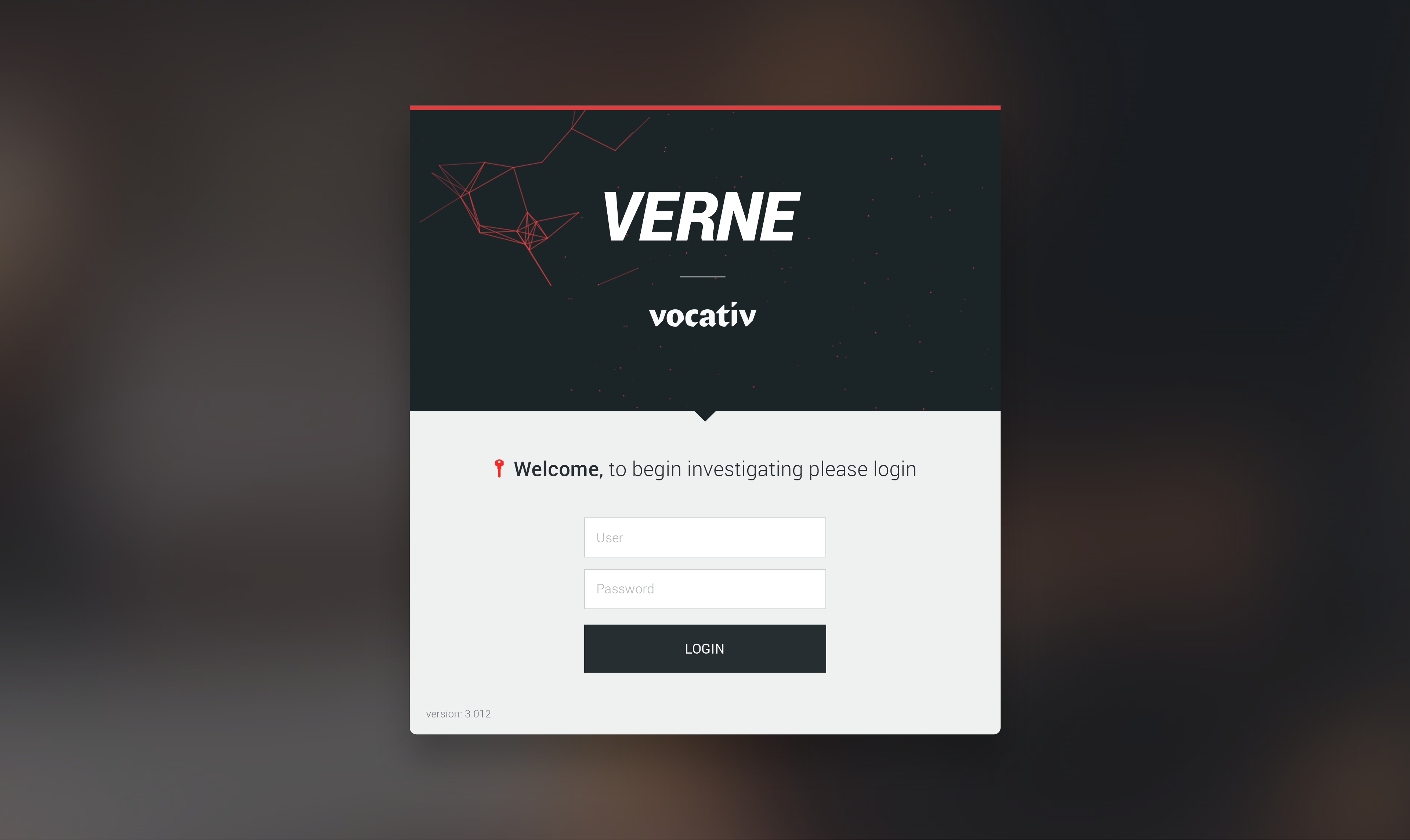
verne.com/login

Project Overview

A part of the technology capabilities developed for business intentions of data analysis. Verne adopted part of those capabilities when we created the application for the sole purpose of news-gathering.

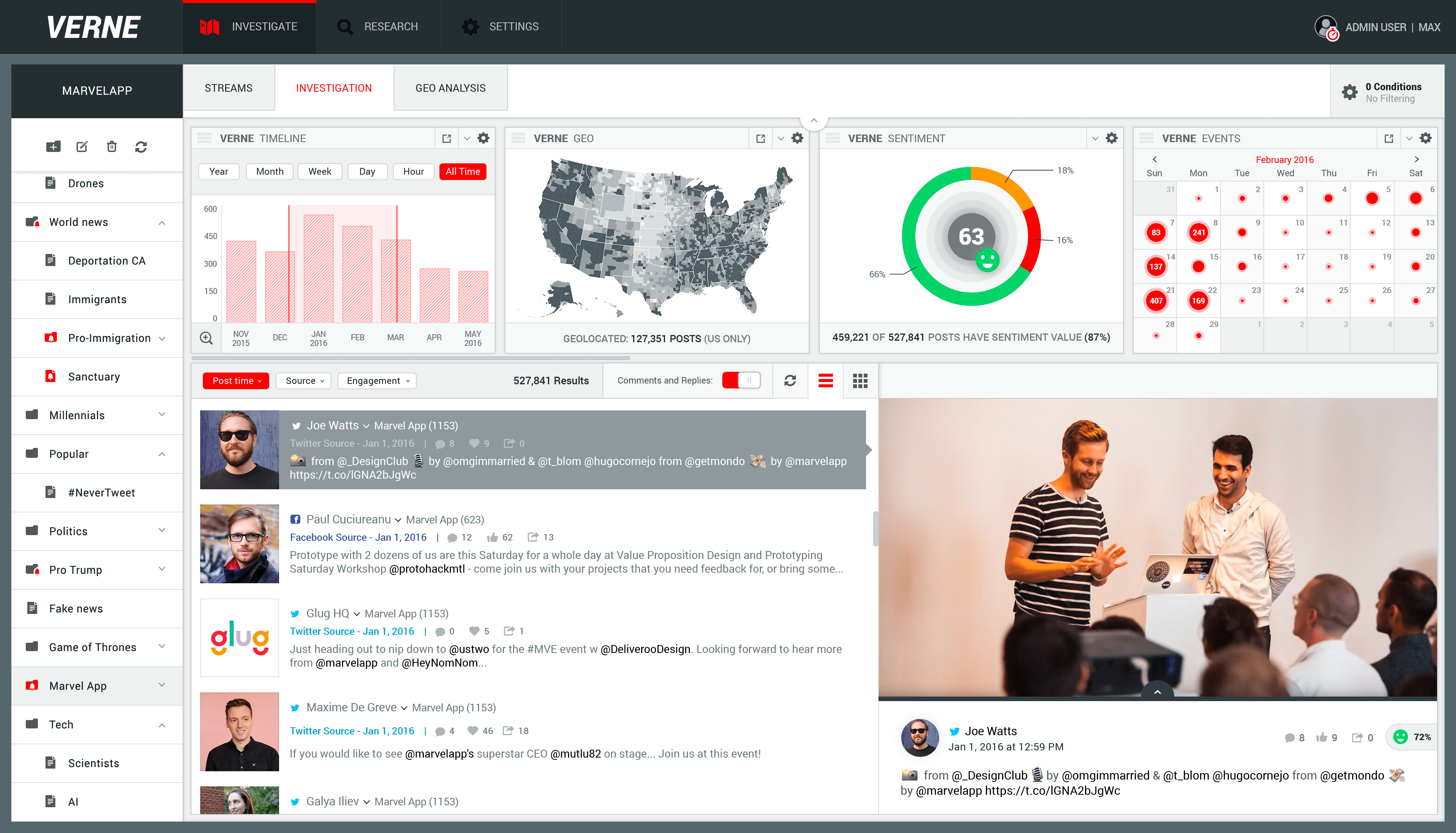
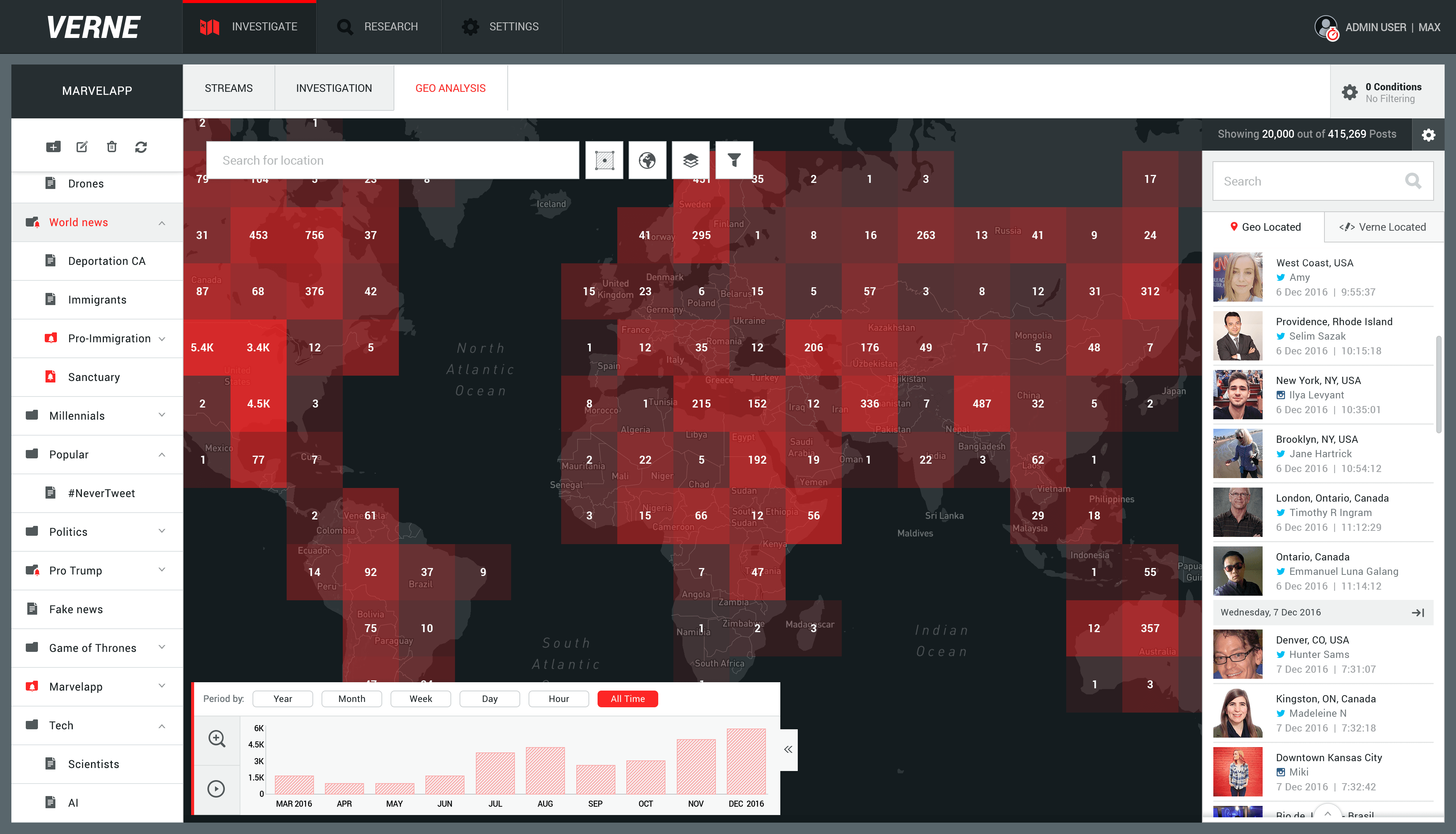
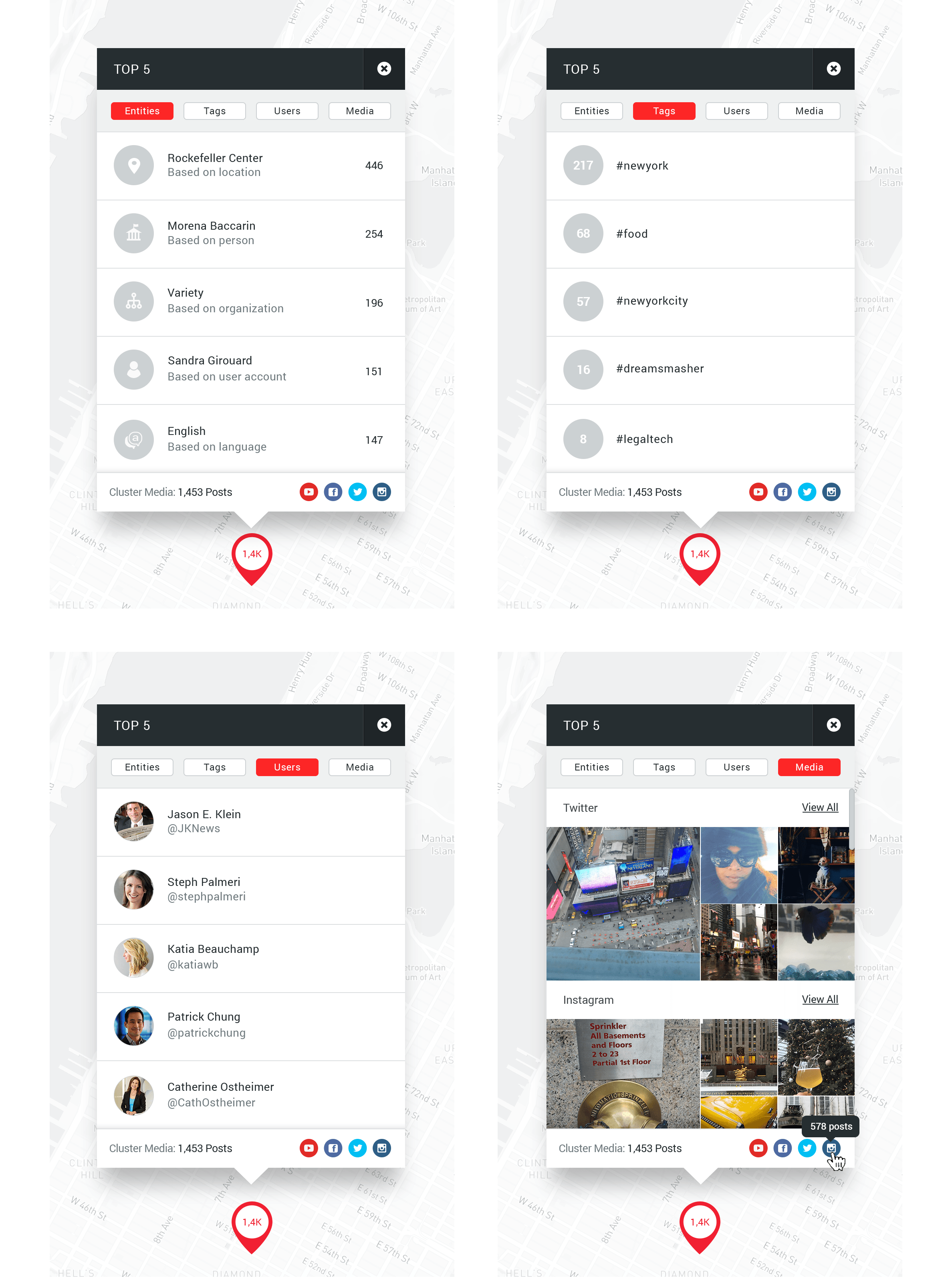
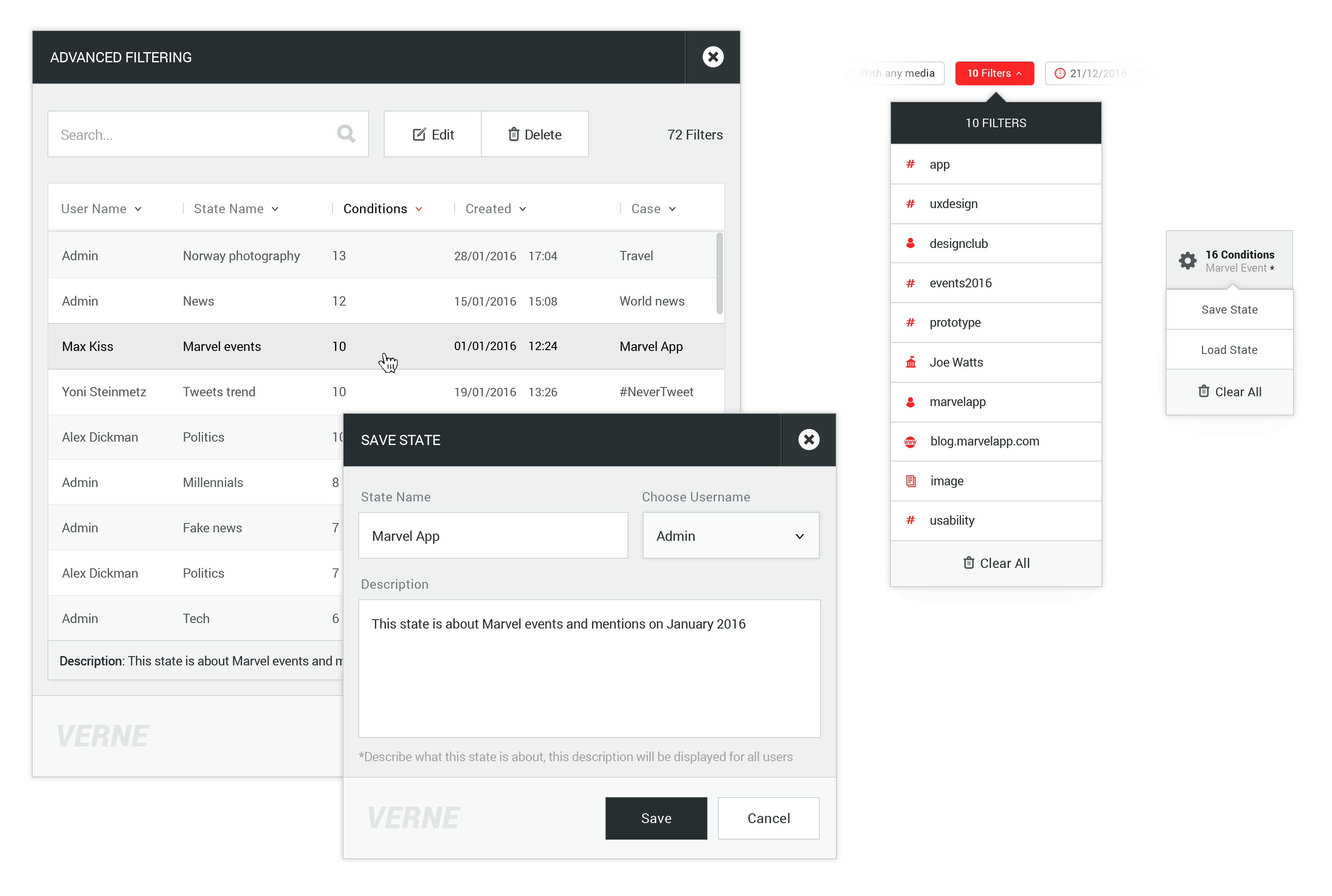
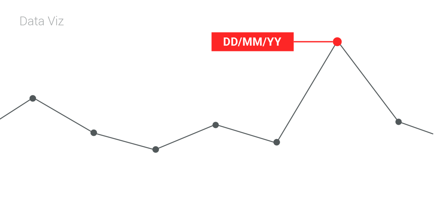
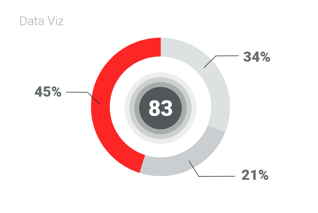
It's named for Jules Verne, and now Verne useful mainly for professional users with a particular skill set of data analysis and data-mining technology. Verne designed to provide insights of social media stories, by analyzing the public data.

Lead new interactions designs through the full design and development cycle of Verne application, craft for new and positive UX, and implement a new UI design in the application.

Defined Use Cases and User Stories, designed features based on users' needs, delivered detailed interactive prototypes.

The Challenge

To lead the creation and implementation of Verne UI standards to provide consistency of experience across the application components.

Create simple user experiences despite complex information and tools both.

Prioritize components in a proper layout, that holds the most meaningful data, based on users' complex workflows and needs.

Define and establish brand guidelines of Verne with a consistent modern UI while using a responsive web design approach.

The Solution

Crafted wireframes and designed mockups to test hypothesis solutions on interactive prototypes that been passed usability tests by Verne users.

Created consistency in improving users' usability and productivity of Verne as well as facilitating while reusing components in the development cycle.

Designed for the ability to recognize the essential pieces in the big collection of data to make sure Verne users are able to achieve their goals quickly.

Maintained a coherent vision of Verne user interface architecture and created data-viz standards visual identity that defined the brand of Verne.

Investigation Dashboard

The old version of this application has tools, which I used their most relevant capabilities to created visual and interactive widgets for Verne which I will describe later.

Next, I designed a new dashboard user experiences by including these new widgets with hidden advanced features for experts users and simple drawers behavior in order to combine widgets, collected data, conversations and some other tools that Verne users work with, in one dashboard.

Design a full view of the Media Feed

This layout designed to focus on posts with media only and its source. Infinite scrolling for the collected data is a must-have feature to create the feed experience both for list and media view.

verne.com/investigation

Visualize Geo-
Located Data

The task was to create the ability to analyze geo-located data fast and easy both for novices and experts users.

The designed solution allows users to choose a way to display geo-located data in a variety of maps and visualization options. A mini-feed showing the most relevant geo-located data that match current map focus, or a specific location.

Timeline widget allows mapping a series of events as they appear in time and provide several ways to visualize geo-located data using Heatmap. The Timeline widget and some more essential tools designed as floating components and are accessible to the user.

verne.com/geo_analysis

View Options

More different view options designed to visualize geo-located data which allow Verne users to analyze the collected information.

- A Heatmap technology which use color and shape to represent the distribution of geo-located data that been collected, this method makes it easy for users to understand this data very fast.

- Marker Clustering the geo-located data, a number on a cluster indicates how many markers it contains and control multiple markers at different zoom levels, and this method is used for a numerical precision.

Single post popups design

A single post represents to the user the information that been collected about every single post in a small pop-up, without changing map coordinates. By clicking on the comments tab, the comments drawer will slide up.

Cluster popups design

The Clustered data popup provides Verne users information about top 5 Entities, Tags and Users that been processed and analyzed by Verne, and Media tab displaying posts with media only.

Advanced filtering

Verne users filtering the data using interactive widgets, the prosses wasn't perfect in case the filtering becomes complex or in case users used the same filtering for few different cases, so the problem was an indication about the filters that been set and repetitive actions.

My solution was to reflect filtering actions on the ribbon and Yoni, the product manager planned the ability to save/load filters, we created new behavior of advanced filtering. I will elaborate on user journey of advanced filtering functions interface a bit more. The conditions user created reflected on the ribbon. Users can quickly get an indication about filter type by its icon on the left of each one of the filters. Hover state on the tag's icon allows the user convey additional information about filter type on a tool-tip above. Hovering the filter tag showing the ability to switch to NOT operator and an option to remove this filter, by clicking on X button on the right.

There are different filter styles for each event in order to get better UX and interactions with the console, events like hover, onclick, ondrag, dragover and drop target, also the NOT filter.

For OR operator: A ribbon structure that can also be AND operator in between filters on this ribbon.

For AND operator: Users can set this multiply condition direct from each widget or combine on the ribbon, by simply drag one filter tags on another to combine and create a group of AND operators. By the prototype that been tested on Verne users AND operators won't be too long, Therefore I designed a vertical structure for AND operators.

Switching to NOT operator: This operator is available to the user on hover state of each one of the filters.

Save New or Load set of filters

Save and Load state of filters are available to the user through a drop-down menu on the right side of the bar. Also, a number of the conditions displayed on adding or loading filter state and this is relevant information to the user. Saving and loading process involved pop-ups.

An indication for the changes that have been made on current state as an asterisk sign for the unsaved state.

Widgets

Users analyze collected data using Verne widgets, these widgets are interactive, they let Verne users filter the data and get the filtered data results reflected on all widgets again. By this data visualization method, Verne turns numbers into narratives and communicate information clearly and efficiently. All Verne widgets present real-time visualizations of data being collected and in a case.

Extended widgets

Part of the widgets has an extended version to allow users get a full visual representation of data; the extended widget may contain more details like dots, lines, or bars, etc. all these depends on data. The user can quickly pop-up each extendable widget from its header.

Widgets library

In order to create the ability to manage a personal dashboard, I designed this widgets library, users may choose widgets they need and easily add them to their workspace.

The library is also designed to organize and represent all Verne widgets, novices may find information and learn about all widgets capabilities in this library.

Research Tools

Verne users do they researches before investigating cases, Verne has a bunch of research tools for these purposes, one of these tools is Twitter Historic Counts which I want to describe on.

Twitter Historic Counts provide access to any publicly available Tweet and generate a set of Tweets matching user's query. While designing this tool, my main goal was to create a simple user experience for how users create queries.

Another mission was to design a way to manage the delivered data and the ability to compare results, in order to allow users analyze and understand the data as fast as possible.

verne.com/research

Iterative Approach

Since users must have the ability to run a bunch of queries one after another, the interaction with the tool has to be simple and clear. The query has to contain time range and the ability to combine up to 5 terms on each.

This UX let users add terms by clicking on "Add Term" button, all input fields will animate and responsively fit in a row. Last fifth term will take "Add Term" button's place.

On focus state, current input field will expand in order to show long text if been cut and get better typing experience. Other input fields will animate and responsively fit in a row.

On hover state of each input field, users can easily remove terms, in case one term been removed all input fields will animate and responsively fit in a row again.

By setting the time range for the "Starting point" using the calendar, the tool will automatically suggest the same day for the "Endpoint" and reopen the calendar again to set a different date for this "Endpoint", in case the user needs to.

Users control the Time Bucket interval to slice the data into a Buckets (series of ranges) that will be shown on the vertical bar of the graph.

Create A Query

Creating a new query in 4 simple steps by setting Time Range, Time Bucket, Query Term and click Run. Queries that's been executed are collecting data, this process may take minutes to hours.

Therefore, an indeterminate indicator will be displayed and reflected on the query document which will be created on the left list. Observe this user flow.

Comparing Results

Using simple line graphs method to compare changes over the same period of time for collected data. Also, showing a set of tweets on each Node using MouseOver event.

Users are able to view collected results of queries on the left list. On hover state of each query, users can easily remove queries from the database.

Users are able to view collected results of queries on the left list.
On hover state of each query, users can easily remove queries form the database.

Establishing visual style and brand identity

The product visual style and brand identity that I created for Verne were inspired by data visualization methodology and company culture. I defined and established brand guidelines like; use of color, typographic treatment, use of Verne logo, use of Roboto as the system font and iconography.

Verne modern UI combining a single color to represent the essential component or a step indication for the user, this technique made a significant impact on entire brand style.